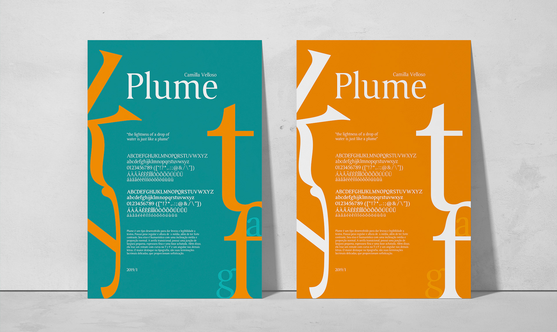
Plume
TYPOGRAPHY | FONT DESIGN | POSTER DESIGN
Development of a typography with delicate lacrimal endings, which provide sophistication made from the training of letter traces and adaptations made to create its own identity. From ink to pencil, each week the work was perfected until vectorization processes began.
After this work, a polishing was carried out to check all the details and thus start to develop a bold version. With that, Plume was created, a type developed to give lightness and legibility to texts.
Academic project
ANO/YEAR: 2018/2019
Location: São Paulo, Brazil
ANO/YEAR: 2018/2019
Location: São Paulo, Brazil

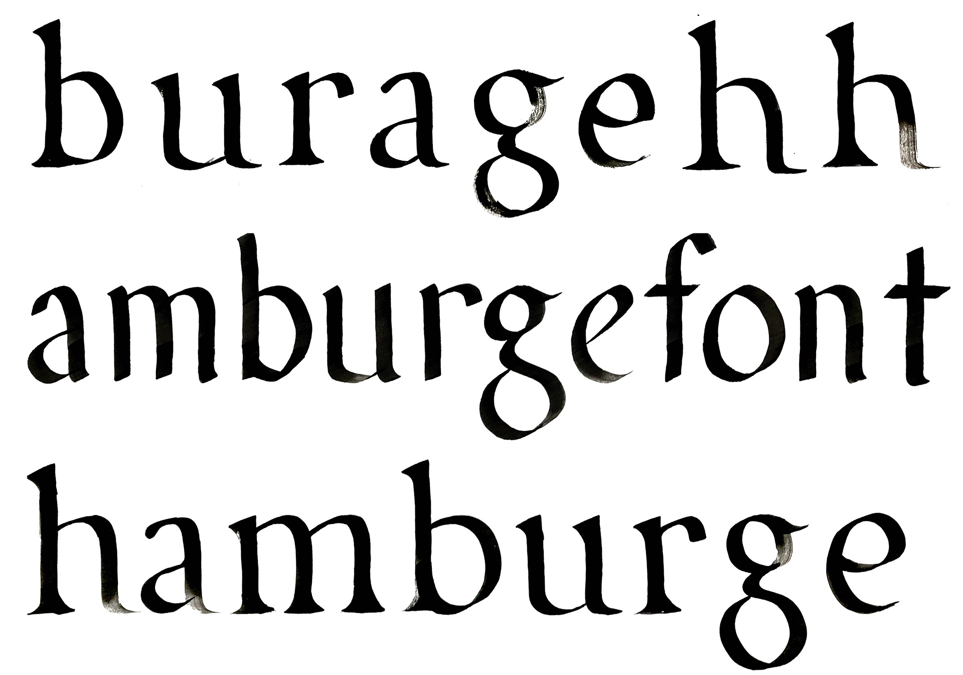
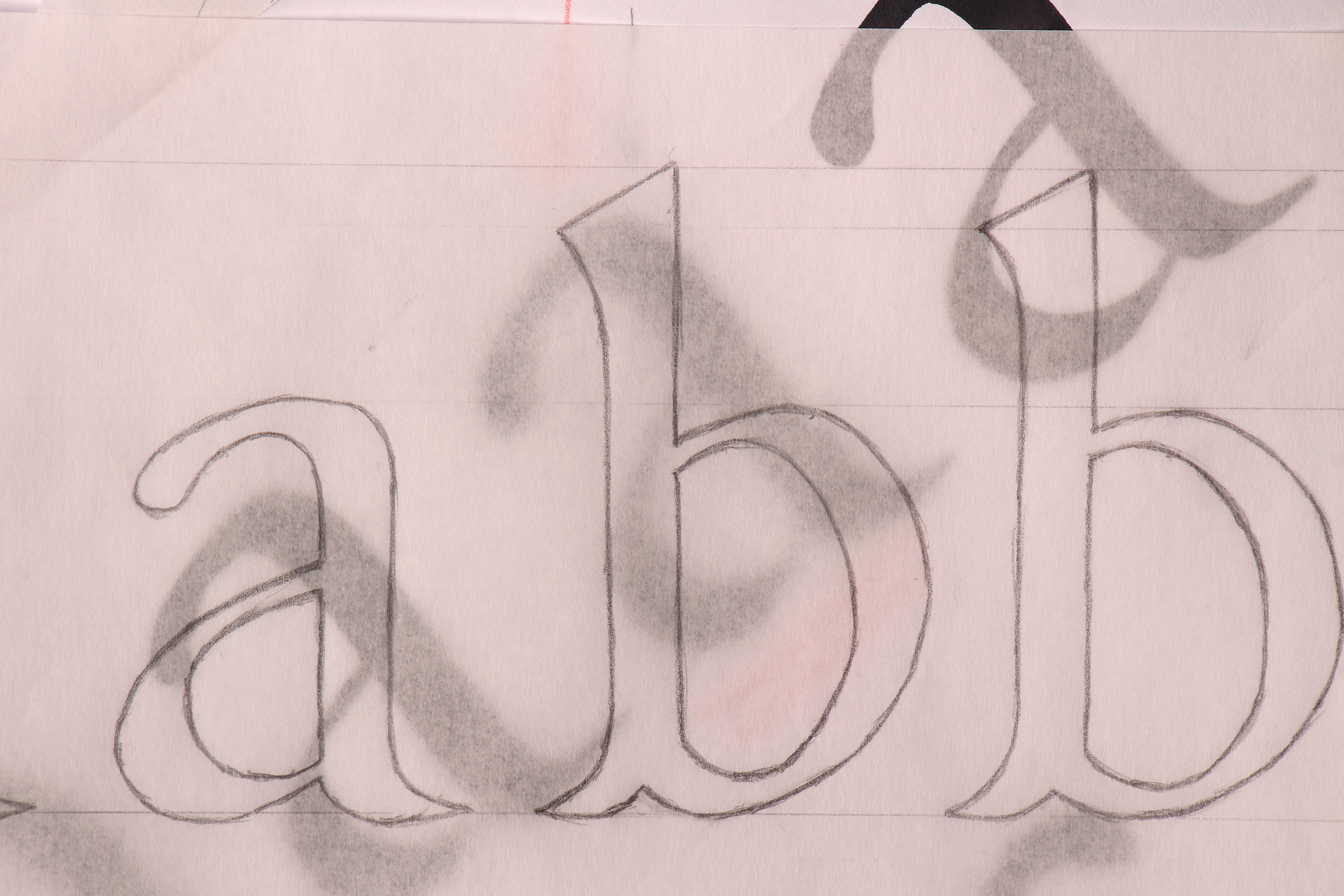
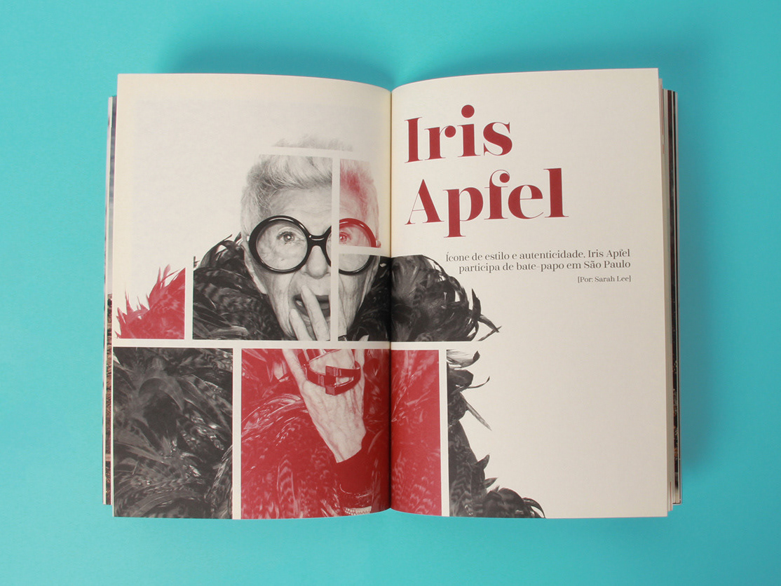
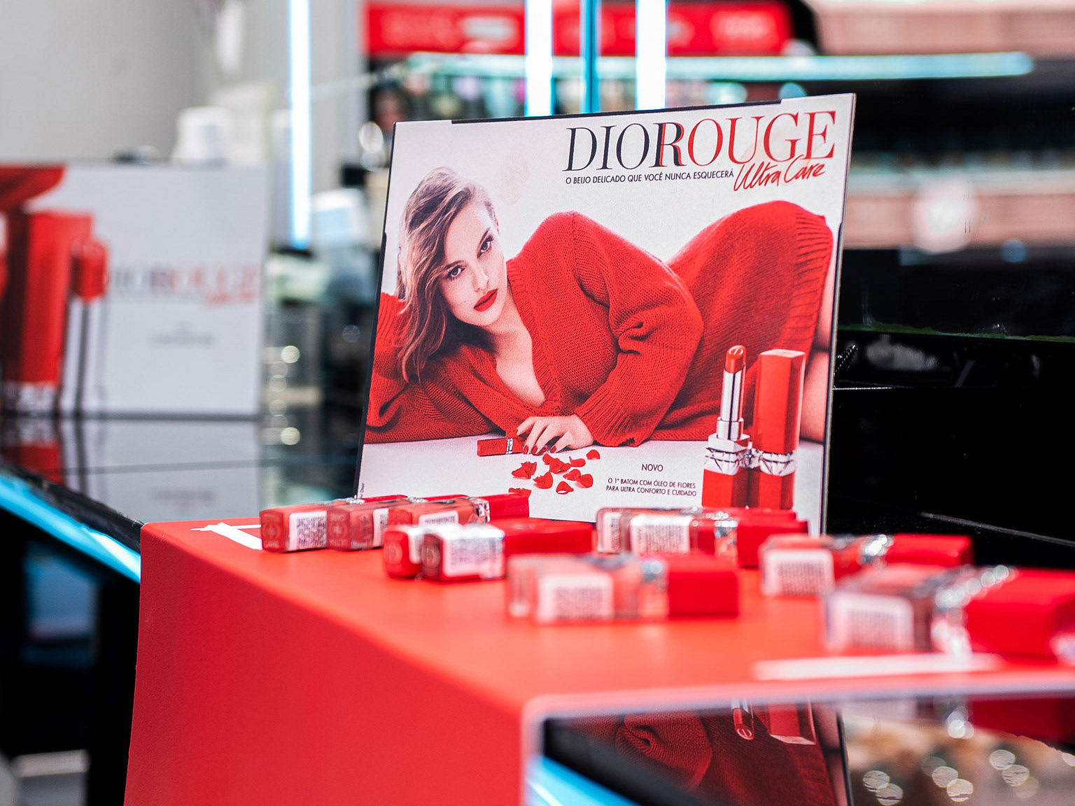
Plume is a type that has a regular weight and average x height, in addition to having strong contrast. Its axis is humanistic with a medium inclination and normal proportion. The transitional serif has a small width, thin thickness and a flattened base. In addition, it has a finish with a curve on the T and F and an angle on the other letters. The biggest highlight in the typography are its delicate tear endings, which provide sophistication.


THANK YOU!
Camilla Velloso
PROJECT AREAS
Graphic Design, Typography, Font Design, Poster Design